A/B LoFi Prototype
Why?
A minor change in a design may alter user behaviour in ways that are hard to detect in a usability test. An A/B test allows you to compare real-world user behaviour across different versions of the product. ~ HAN University of Applied Sciences - Amsterdam University of Applied Sciences (z.d.)
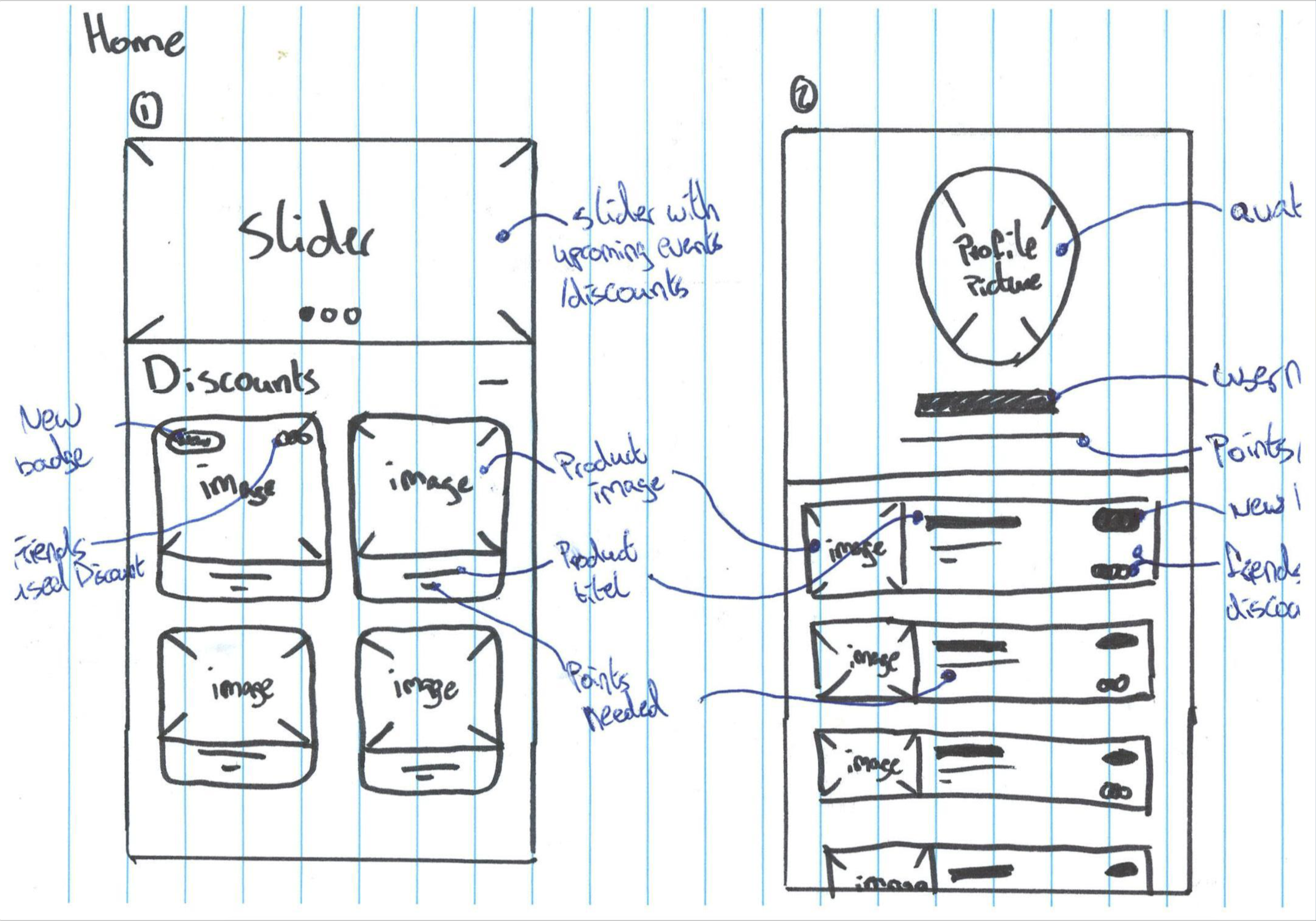
In this stage I will come up with two variants of the needed functionalities to test which one looks and feels the best. At the end of this experiment the direction of the complete design should be set.
How?
I will create two LoFi drawings per screen. Beside these sketches I will elaborate what everything on the screens mean or do. These sketches will be presented to various stakeholders to decide direction to choose.
Result
A/B Prototype drawings

The complete set of drawings can be viewed in pdf format
Chosen versions
After reviewing the drawings with various stakeholders the following was decided.
- Login; Choice 2
- Home; Choice 2
- Agenda; Choice 1
- Profile; Choice 2
The pdf file with the drawings also contains some sketches for an ordering page. The ordering pages didn't end up making the final prototype design. This was an idea brought upon me by Ken Harper during a visit to CMD. After doing some research by being a fly on the wall ass suggested by Ken i concluded that the club wouldn't benefit the club thus rejecting them for the final design.